 I’m standing at the front of a darkened room full of middle-school girls, telling them about user interface patterns and trying to get them excited about reading Apple’s iOS Human Interface Guidelines.
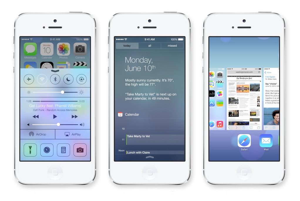
It’s going better than I’d thought – on the whole, they’re pretty attentive. I guess that’s the kind of girl who signs up for a week-long summer camp about iOS development. Then I arrive at my single slide about the upcoming changes to the platform (they’ll be working in iOS 6 this week, so I don’t want to bombard them with the monumental shift in form that is the iOS 7 beta). Suddenly a hand shoots up.
“Why did they DO that?”
I do my best to answer, but leave thinking I owe them a fuller explanation and more analysis. So here goes:
From faux 3D to real 2.5D
According to Apple, the crux of iOS 7 is emphasising the user’s content by doing away with ornamentation, but iOS has always been about giving the user’s content top priority in every app – that’s been one of the main tenets of its human interface principles since its inception.
This used to mean using rich, photo-realistic details and analog metaphors to help users intuit how to use an app, allowing them to access their content or accomplish their task as quickly and easily as possible. But visual cues that once helped us understand how to interact with a brand-new type of device have grown cumbersome and stale as we’ve grown more and more accustomed to using these devices. The subsequent stripping away of artifice and ornamentation in iOS 7 hasn’t actually changed many interface patterns; it’s merely removed unnecessary distraction.
In shedding this faux-3D skin, iOS has transformed into something remarkable, with a new kind of depth and motion. Apple has given up the artificial 3D image techniques of deep shadows, strong highlights, and gloss in favour of relying on spry animation and the parallax effects of flat planes to convey the sensation of depth. Developer Manton Reece compared it to multi-plane camera technology. In my former life at an animation studio, I called it “two-and-a-half-D” (2.5D), but it’s the same idea: Using AfterEffects, I’d set backgrounds and images on different planes on the z-axis, and animate a virtual camera to move through and around them. The planes could never look fully three-dimensional, but the parallax and depth-of-field effects were far more compelling and life-like than simply moving an image from left to right.
iOS 7 harnesses 2.5D and uses it to enhance your sensation of depth. The faux 3D effects used in previous versions of iOS would clash here, rendering the illusion of space less effective. Simply tilting the phone hints subtly at where elements exist in relation to each other and to the background. Moving through the interface from home screen to folder to app feels like the short film Powers of 10, or like falling into Mary Poppins’ carpet bag. It is larger than it first appears, and the effect is delightful.
Armchair art direction
The static screenshots we all dissected on day one actually do iOS 7 a disservice, as they cause the focus to rest on elements in a frozen state, when the beauty of this new direction lies in its depth and motion. That said, professional and amateur critics alike have voiced some valid concerns. While design is often subjective, many of problems that have been noted with iOS 7 are ones that already have solutions, which is why they feel like missteps here.
The use of Helvetica Ultralight as the system font is a mistake. I can say this more confidently than my other gripes, as I have my own 20/15 vision and the opinion of revered typography expert Erik Spiekermann to back me up on it. He calls the choice a “youthful folly”, saying that in large swaths at 13-point, the text looks like a lovely, smooth carpet – and is also completely unreadable. While iOS does let users adjust font sizes throughout the system, it may be a bad sign if many or most people choose to increase them by default.
Jony Ive’s icon grid is also “wrong”, in that the glyphs within the icons just don’t look harmoniously balanced. Panic designer Neven Mrgan has a great post on this (full disclosure: he’s my husband and a ridiculously attractive dude, though I’d agree with him on this regardless). Upon viewing a static image of the home screen after watching the WWDC keynote, I had a visceral reaction to many of the icons, and I’m still hoping that they’ll change before the final version of iOS 7 is released.
The final major problem I see is with the general lack of emphasis and differentiation between choices. Action sheets in particular feel too austere to me in their current form; with button borders gone and the only indication of the “preferred” choice being ever-so-slightly bolder text, I worry about user confusion. It’s impossible to tell at a glance what the least destructive option is, and sometimes it’s hard to tell what’s content and what’s UI.
For every nit I pick, though, I have an exuberant exaltation. This is a major overhaul of an established operating system, and it happened in seven months. It’s an incredible step in what I see as a very cool direction.
Apple kills its darlings
Apple is a master of reinvention, and this stripping away of artifice in favor of dimension and liveliness is the kind of bold move the company was overdue to make. It’s the nature of Apple, and the nature of creative work in general: When something stops working or grows stale, it has to go. Sentimentality doesn’t make for good design.
iOS 7’s overhaul isn’t just a matter of taste (though I’d say Jony Ive is the Design Within Reach to Forstall’s Ethan Allen); it’s the necessary step in a new and exciting direction. With this shedding of false 3D in favor of the slightly more real and kinetic 2.5D, Apple is trying to make the device itself disappear. The lightness and airiness of iOS 7 somehow lends an already-thin device the impossible illusion of an ultra-slimness that contains multitudes.
And to the girls at App Camp, I’d say, “Apple did it because after six years it was time to move on. I can’t wait to see what you make.”