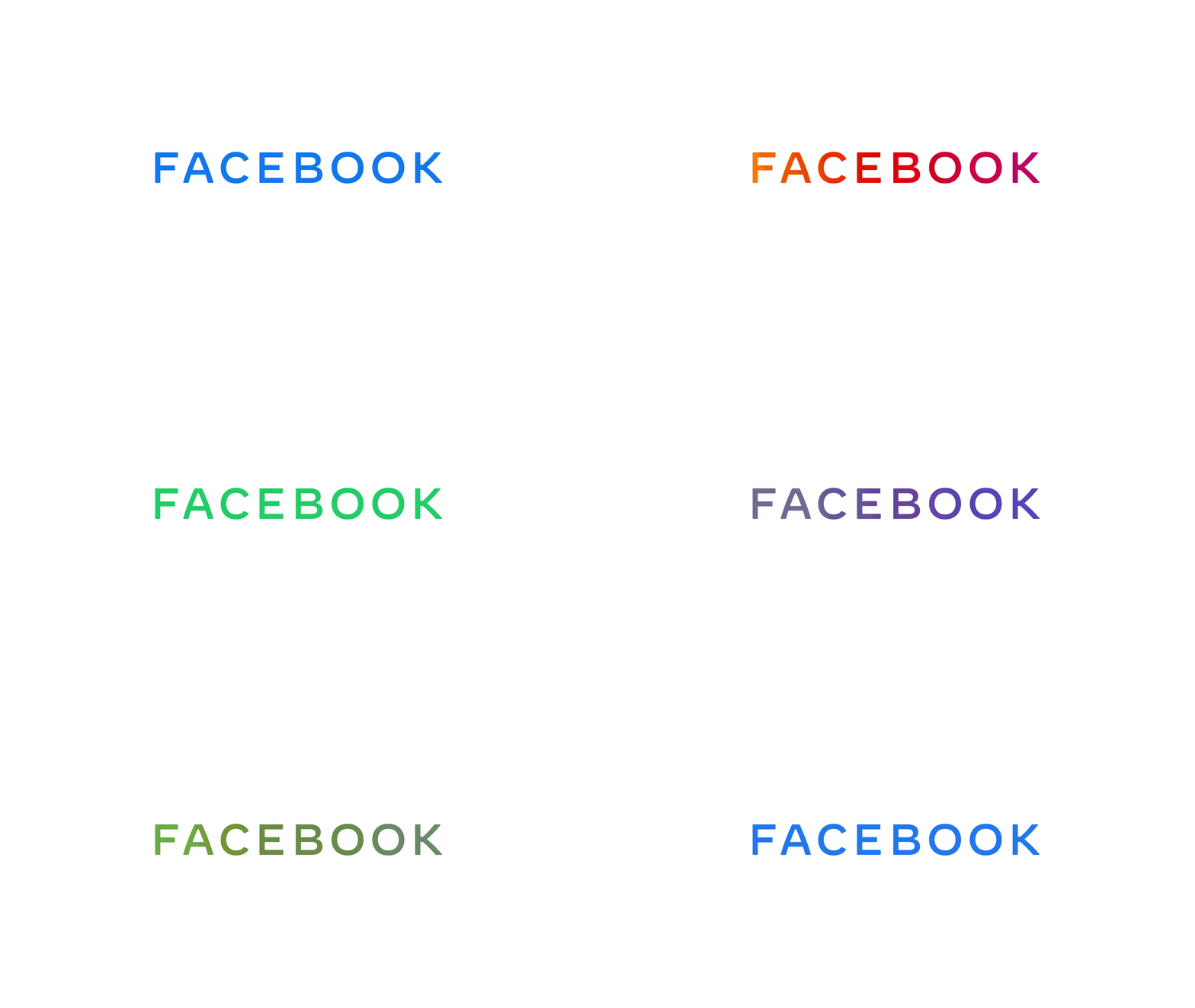
Facebook unveiled a new logo to represent the parent company of the homonymous social network, WhatsApp, Instagram, Oculus, Workplace, Portal and the much-debated Calibra.
The logo, which just features “Facebook” in a simple sans serif font, was presented in a multi-colour gif representing each product – blue for Facebook, pink for Instagram, green for Whatsapp and so on.
In an official statement published by Chief Marketing Officer Antonio Lucio, the company explained the logo was introduced for “clarity”, using custom typography and capitalisation in hope to create a visual distinction between the company and social network app.
The statement also added, “Facebook started as a single app. Now, 15 years later, we offer a suite of products that help people connect to their friends and family, find communities and grow businesses.
Today, we’re updating our company branding to be clearer about the products that come from Facebook. We’re introducing a new company logo and further distinguishing the Facebook company from the Facebook app, which will keep its own branding.”
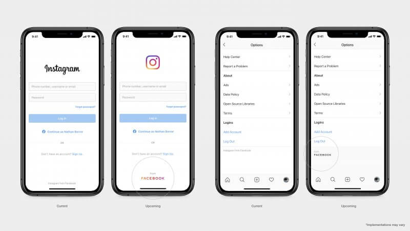
The new logo will be fully implemented within Facebook’s products “over the coming weeks”, and it will also see the launch of will a new company website.

According to the same statement, the logo has also been introduced in a bid to make sure users know that all Facebook products have shared infrastructure and their teams often work together.
However, amid all the controversy the tech-behemoth has been facing for years now, the introduction of the new logo also feels like a strategic decision to create a very clear distinction and distancing itself from their controversial homonymous social network.
The move could also prove damaging – according to research by Pew Research Center, only 29 percent of Americans were aware that WhatsApp and Instagram are owned by Facebook. With the introduction of the new logo, Facebook could see users mistrusting their most liked products because of their association with the Facebook app.


