When it comes to security, context is key. CSO looked at eight of the web’s most popular cyber-attack maps.
While the maps themselves are mostly eye catching with limited context, there are some creative ways they can be used.
Entrenched security professionals view cyber-attack maps with a somewhat jaded eye. They call them “pew pew” maps, mimicking a child-like sound to represent gunfire when playing with toys. In fact, one map actually uses these sounds to an amusing effect.
Some of the professionals CSO spoke with said they’ll pop one of the maps up on a screen in the SOC (Security Operations Center) if they know a client is coming in, but only because of the eye candy factor. In fact, most of the professionals said they’ve used them, but other than “performance art,” there isn’t any real value in them.
“If I found one that’d add value, we’d use it,” one security executive said on Twitter.
The common misconception with cyber-attack maps is that the data is live, or real-time. It isn’t. Most are just a subset of recorded attacks or a playback of sanitized packet captures.
But don’t discount how useful the eye candy factor can be: one security professional said he uses them to get high schoolers interested in the security industry. The concept is smart, as the visuals and datatypes on display can create discussion points on attack types, methods and threat actors.
Some SOC operators do the same thing for clients, using the maps to visualise attack types and try to answer customer questions. Again, the value of these cyber-attack maps isn’t the data they’re showing, it’s how they can be used as a conversation starter. This is something the vendors that produce the maps know well, as the maps themselves are sales tools.
Norse
Probably the most well-known cyber-attack map is the one produced by Norse, a security firm that’s had its share of problems over the last few years. Discussing the data shown on their map, Norse says the attacks are “based on a small subset of live flows against the Norse honeypot infrastructure…”
Interestingly enough, organisations can add their logo to the map when it is displayed at the office.

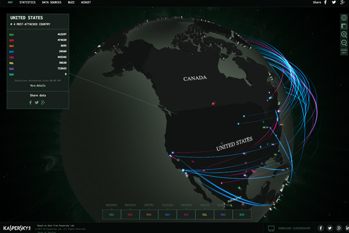
Kaspersky
Taking first prize for visuals and interactive displays is the Kaspersky “Cyberthreat Real-Time Map” – complete with global rotation and zoom.
The attacks shown on the Kaspersky map are taken from on-demand and on-access scans, as well as web and email detections. But it isn’t clear just how real-time, the real-time presentation is.
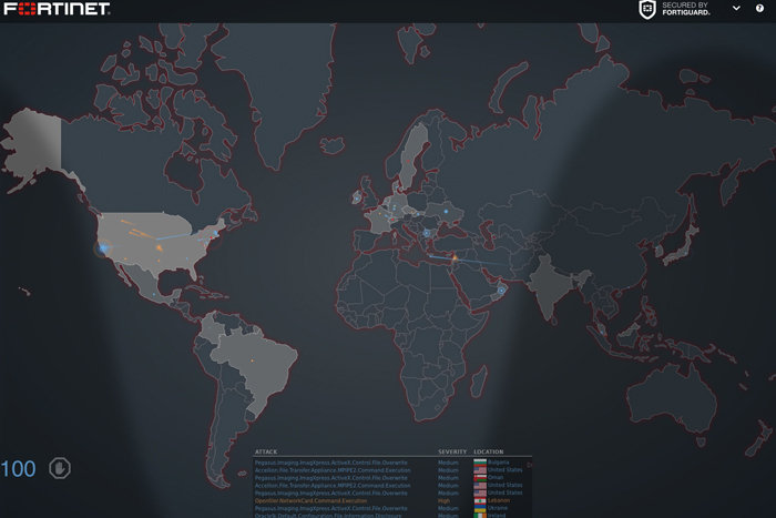
Fortinet
Fortinet’s cyber-attack map looks similar to the one from Norse and appears to show a playback of recorded events. As the attacks are displayed, a rotating breakdown of various stats appears in the lower left part of the screen. Fortinet customers have the ability to have a map of their own, according to documentation.
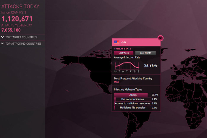
Check Point Software
The ThreatCloud cyber-attack map from Checkpoint Software shows historical data that is reset each day at 12:00 a.m. PST. The map is more visual than the one from Norse, but still has the same basic construct. In addition to watching the playback, the top attackers and targets can be viewed historically, with monthly and weekly stats.
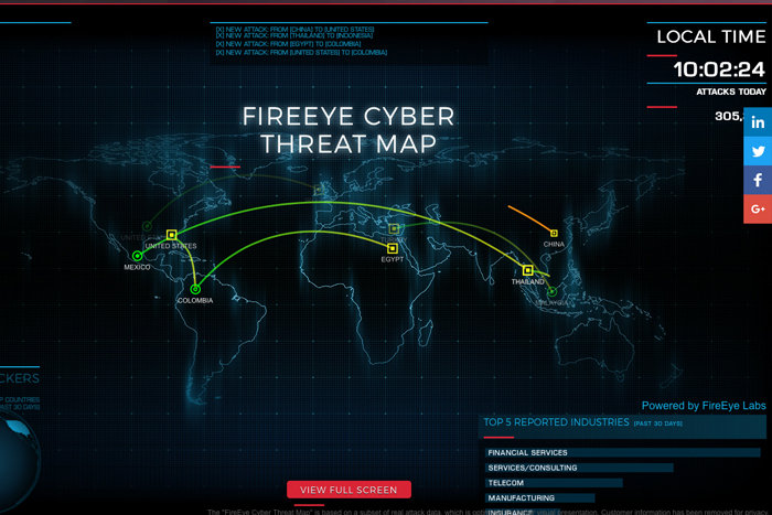
FireEye
The FireEye cyber-attack map lacks the detail presented by the others, and keeps things simple. It tracks historical data and splits it into industry segments and top country of origin for attackers. The data displayed is “based on a subset of real attack data, which is optimised for better visual presentation.”
Arbor Networks
The cyber-attack map from Arbor Networks is a hybrid map that was created in part with Google Ideas. The Digital Attack Map tracks DDoS attacks with data from Arbor’s ATLAS threat intelligence system. The raw data is sourced from more than 300 ISP customers, and 130Tbps of global traffic. The map will visualise DDoS attacks and allow filtering by size and type.

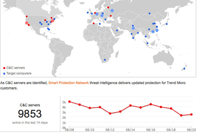
Trend Micro
Trend Micro’s Botnet Connection Dashboard is a smaller, stripped down cyber-attack map that tracks C&C (Command and Control) servers used by botnets (and their targets) across the globe. The age of the data shown isn’t clear, but the historical data tracks back 14 days.
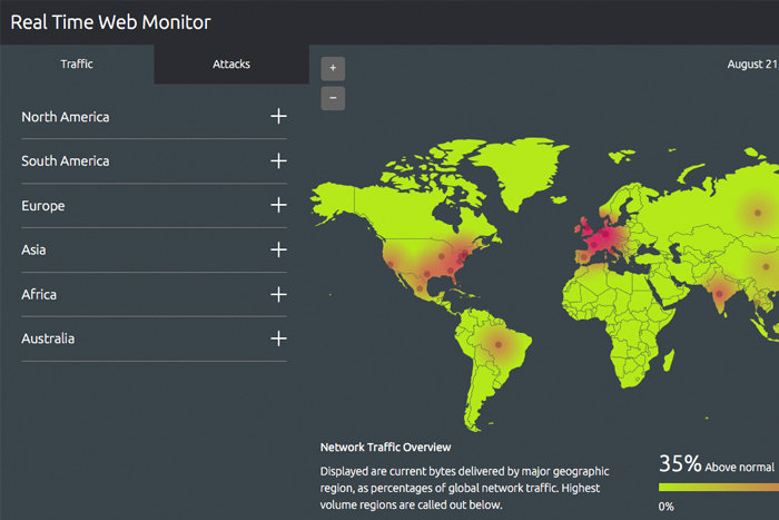
Akamai
The Akamai real-time monitor isn’t a typical cyber-attack map, but we’ve included it here because it does track attacks in addition to traffic on the Internet. Once loaded, it’s possible to see what regions in the world have the most traffic volume; in another tab, you can see what regions are experiencing the most attacks. Akamai says the data is presented in real-time.