Before I dig in, allow me to preface the following with this: I am a photo dabbler. As such, I’ll explain what I can from the perspective of such a dabbler.
There are far more powerful applications you can use to edit your images and more interesting (and, in some cases, convoluted) ways to adjust them. Consider the following the first steps in image editing. I’ll leave it to the pros to offer more-advanced techniques and tools.
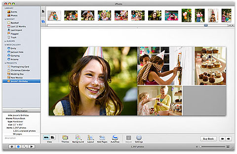
The Edit window
To begin the editing process, select an image and choose Photos > Edit Photos (Command-E) or click the Edit button at the bottom of the iPhoto window. In the resulting window, you’ll see an enlargement of your image, previews of nearby images below, and, to the right, three tabs–Quick Fixes, Effects, and Adjust. Let’s walk through each one.
The Quick Fixes tab
The Quick Fixes area is for those people who want to make very broad edits without a lot of bother. Here’s how the options shake out.
Rotate: If your image is displayed in portait orientation when it should be in landscape view, you can rotate it with this control. Click Rotate, and the image will do just that in a 90-degree counterclockwise direction. (If you’d like it to instead rotate in a clockwise direction, hold down the Option key and clickRotate.) Keep clicking until the image is in the orientation you desire.
Enhance: This is iPhoto’s “Take Your Best Shot At Fixing This Image” button. Click it, and iPhoto will set about adjusting levels, exposure, contrast, saturation, and other controls so that–in the application’s view–the image looks better. This is your avenue to the quick and dirty one-button edit. In some cases, Enhance vastly improves the image. In others, those adjustments may be a little too rough for your liking. You can use other controls to tweak the settings that Enhance has imposed. Or, if you’re entirely unhappy with its work, just click the Undo button at the bottom of the pane and read on for other ways to edit your images.
Fix Red-Eye: If a flash photo results in subjects with glowing vampire eyes, you can use Fix Red-Eye to do exactly that. When you click this button, you’ll see that the Auto-fix red-eye option is enabled. This means iPhoto will seek out those glowing eyes and attempt to remove the red. If it doesn’t do so to your satisfaction, switch off this option and then try it manually.
You remove the red-eye effect manually by hovering your cursor over the subject’s affected eye. If the target cursor is too large or too small, use the Size slider to make it as large as the eye’s red zone. Then click on the eye. This should turn the pupil from red to black.
This can be an effective fix, but it can also be a bit creepy in a Margaret Keane kind of way–particularly if you then enlarge the image so that the effect becomes more obvious. To help avoid Weird Big Eyes, make the diameter of the selection as small as you effectively can.
Straighten: A straightforward control (ah ha ha ha…erm) is the Straighten button. Click it and you encounter a slider that allows you to adjust the angle of the image 45-degrees clockwise or counterclockwise. Aiding in your adjustment is a grid that appears over the image. To use it, find something in the image that gives you a reliable horizon line (say, the horizon itself if you’ve taken a shot of the sun setting over the ocean). Drag the slider so that the image appears to be appropriately aligned.
Crop: You may be the rare photographer who captures exactly what she wants with every shot. The rest of us, however, depend on cutting out the stuff on the edges to make for more-compelling images. That’s the point of the Crop tool. Click it, and the frame around the image becomes adjustable.
There are two ways (and reasons) to crop. The first is that you’d like your image to fit a particular media or display–for example, you intend to create 4 by 6 prints of the photo. Or you’d like the resulting image to fit in a perfect square. In such cases you should click the pop-up menu that appears when you click Crop. Here you’ll find a variety of settings that allow you to crop your image to specific dimensions or shapes. When the Constrain option is enabled you can’t change the ratio of the image–regardless of how you resize the selection of a 4 by 3 image, it will always have that 4 by 3 dimension. If you disable theConstrain option, you can resize the image in any way you like by dragging the sides or corners of the selection.
The other reason to crop an image is to get rid of content that you don’t want to see. In a group photo, for example, Cousin JoJo has ruined a picture by leering at a passerby while standing at the end of a line of otherwise well-behaved relations. Use the Crop tool to excise him from the picture. Or you may find that a picture feels a little too static with the subject standing smack-dab in the middle of the frame. Use the Crop tool to sheer off one side of the image, and you may end up with a more interesting picture.
To actually make the crop, create your selection and click the Done button that appears within the Crop area. The unselected content will disappear, and the cropped image will zoom to fill the preview area. To undo the crop, click the Undo button at the bottom of the pane or once again click the Crop tool and click the Reset button.
Retouch: Oh, no–Cousin JoJo has earned himself another angry dueling scar, and just in time for Aunt Murleen’s fourth wedding. What to do about the resulting images?
Conveniently forgetting to photograph your cousin is one option, but if he has weaseled his way into the frame despite your attempts, you’ll have to do something on the back end. And that’s one reason the Retouch tool exists. Click it and you find a Size slider. Adjust this so that it covers whatever it is you’re trying to cover, and “paint” over the offending area. When you let go of the mouse or trackpad, iPhoto looks at areas just outside of the painted area and blends those colors in to cover what you’ve painted. It’s a little like slathering makeup on an offending carbuncle.
In the case of JoJo’s scar, the effect could look unrealistic, particularly if the scar traverses his brow and nose. The Retouch tool removes important details including contours and shadows. So while it’s good for things like blocking out the occasional pimple or–even better–dust that’s landed on your lens, you’ll want to use it sparingly (or not at all) in situations where you want to cover up something big and bold.
The Effects tab
The Effects tab holds controls for making quick adjustments to exposure, contrast, temperature, and saturation. In addition, you can apply a variety of effects to “vintage-ize” your images. The tab’s included elements are:
Lighten and Darken: With each click of these buttons, the image’s exposure setting increases or decreases, respectively, by 0.10 on a scale of +/– 3.0. The setting adjusts only the image’s exposure, not its highlights or shadows.
Contrast: The Contrast button works similarly. The difference is the scale. Contrast offers a scale of +/– 100. Each click of the Contrast button boosts the image’s contrast in increments of 5. When you increase contrast, you make darker areas darker and lighter areas lighter. Adding contrast often adds a bit more drama to an image. Remove contrast, and the image gets flatter.
Warmer and Cooler: Photographers talk about colors as having a particular temperature, as measured on a Kelvin scale. iPhoto supports this idea by allowing you to adjust an image’s warmth or coolness. Broadly, when you click the Warmer button, the image will become more yellow. Click Cooler, and the image adopts blue tones. You might use the Warmer button to give an image shot indoors with a flash a more lamp-lit look. If an image is too yellow because it’s lit with an indoor bulb, you can pull out some of the yellow by clicking Cooler.
Saturate: The result of increasing an image’s saturation is that nonneutral colors (such as gray and white) become bolder. So, clicking the Saturate button will bring out reds, blues, greens, yellows, and so on more effectively. Dull colors such as gray aren’t affected, nor are white and black. Saturating an image can often make it feel more vibrant. Oversaturating an image can make it appear garish or unnatural. In the case of saturation, you can definitely have too much of a good thing.
The effects below: Below these buttons you find effects presets that include B & W, Sepia, Antique, Matte, Vignette, Edge Blur, Fade, and Boost. You can add any or all of these effects to your image by clicking them. The B & W and Sepia effects are either on or off–you can’t apply them by degrees. You can increment the other ones up (or, once applied, down) by clicking on the effect. If you click the Noneeffect, all the effects you’ve applied are removed. Now, a few words about some of these effects.
Professional photographers will tell you that a one-button black-and-white effect like this will produce poor results. That if you want to create stunning black-and-white images, you’ll use a professional photo-editing application rather than relying on iPhoto’s single-button solution. I, as dabbler, will also tell you that you can do better, but you may be able to do so within iPhoto’s editing environment. We’ll get to that shortly.
The other two effects I’ll call your attention to are Vignette and Edge Blur. I do so because, when applied sparingly, they can subtly enhance an image. Give the Vignette effect a single click, and you find that the corners and edges of your image get darker. If you’re working with an image that already has a dark border, this can direct the viewer’s eye to the center of the image where your subject is. On the other hand, if your image is bright around the border, the Vignette effect is likely to look old-timey and, frankly, a little cheesy. The Matte effect very much feels this way.
Edge Blur can have the same result of focusing the viewer’s eye toward the middle of your image. Click it once and you may like what you see. More than a single click, however, and you enter Vaseline-on-the-lens territory, which can make for a soppy, overly emotional image.
The Adjust tab
Apple places the Adjust tab at the end of your edit options because many iPhoto users prefer the easier adjustment options found in the Quick Fixes and Effects tabs that precede it. Were they to see the Adjust pane first thing after revealing the Edit area, they might be scared off and immediately click away with a “Holy smokes! That’s too complicated for me!”
I assure you that it’s not. Let’s take a peek, section by section.
Histogram: The hills-and-valleys graph you see at the top of the Adjust pane is called a histogram. This graph represents the distribution of tones–from dark on the left to light on the right–contained within your image. The higher the peaks, the more pixels are present within that tonal range. So, if you see a lot of peaks at the far left side of your image and few on the right side, your image is going to be dark. Peaks at the far right indicate that areas of your image are blown-out–pure white with no image detail in that spectrum to work with. The material between the left and right sides are midtones. A “good” (or, really, a workable) image will show a fairly even distribution of tones across the histogram.
Just below the histogram are three sliders. The slider on the left is the Black Point slider, the one in the middle the Mid-Tone slider, and the slider on the right the White Point slider. These sliders define how iPhoto should interpret “this is black, this is the center of my midtones, and this is white,” respectively. By adjusting these sliders, you redefine these points and the image then changes.
One of the easiest ways to see this in action is to find an image that has a lot of material in the middle of the image but nothing on either end, indicating that it contains no deep blacks or bright whites. If you drag the Black Point and White Point sliders so that they each touch the place where the graph drops off (thus redefining the black- and white-points) your image will gain more contrast. However, in the process it may get too dark or too light.
That’s where the Mid-Tone slider comes in. Slide it to the left or right and mid-tones are also redefined. As you drag to the left, the image gets lighter as more tone shift right (or to the brighter part of the range). Drag to the right and the image darkens. Play around with these three sliders and you may find that what were once flat and uninteresting images now have new life.
Exposure, Contrast, and Saturation sliders: These three sliders give you finer control over the Lighten, Darken, Contrast, and Saturate buttons that you found in the Effects tab. Shove the Exposure slider to the right, and the image gets brighter. To the left and it darkens. As I explained earlier, the Contrast slider increases or decreases the difference between light and dark areas. And Saturation pumps up or tones down colors. Note that when you move these sliders, the histogram changes. This can help you better understand exactly what the histogram is doing, and what a “good” graph looks like.
Below the Saturation slider is the Avoid saturating skin tones option. Enable this when you have an image with a human subject, and you’ll find that their skin tone remains constant while the image’s other colors change as you adjust this slider.
Definition, Sharpness, and De-noise: I gang these three sliders together because they address an image’s detail. Similar though they may sound, they do different things.
You use the Definition slider to add some detail, which generally involves removing “haze” from your image. At its most extreme setting, everything in the image becomes clear. In some cases–with a landscape, for example–this can be great. But impose too much definition on a picture of your dearest and nearest, and you’ll find the results harsh. Regardless of how stunning your subject may be, every portrait needs a little softness.
Sharpness increases the contrast between adjacent elements–for instance, a subject’s hair against their face. As with Definition, at high levels Sharpness can create harshness.
De-noise is an effect that will attempt to smooth out overly pixelated or too-sharpened images. You might use it if you took an underexposed shot (as you might indoors without a flash), pumped up the exposure, and then found that the image was blocky-looking when zoomed in. But overuse it, and you’ll discover that it smears away detail.
Highlights and Shadows: When you first use the Highlights and Shadows sliders, you may believe they were misnamed. For when you adjust them you find that they give you less of the thing you’re adjusting. For example, when you push the Shadows slider to the right, the image’s dark areas lighten. Do the same with the Highlights slider, and bright areas are tamped down.
But don’t let this get in your way of using these two sliders. They’re very helpful. For example, if you’ve taken a shot where there’s a bright light behind your subject (and they appear gloomy in comparison), adjusting the Highlights slider reduces the glare in the background, helping to bring your subject to the fore. And if your subject is murky, cranking up the Shadows slider can help bring them into the light.
Extreme adjustments with either of these sliders may produce a “halo” effect around your subject, where they’re unnaturally separated from the background. So use each slider judiciously and in tandem with Exposure, Contrast, and histogram adjustments.
Temperature and Tint: I talked earlier about adjusting an image’s temperature between the blue and yellow extremes. You’ll find you can do this in the Adjust pane with the Temperature slider. Additionally, you can make adjustments between purple and green hues using the Tint slider.
But you can save yourself some work by relying on the Eyedropper tool found next to the Tint slider. Click it and then click on a gray or white area in your photo. This tells iPhoto “This is what I consider a neutral color. Adjust all other colors accordingly.” When you do this, iPhoto makes its calculations, and the Temperature and Tint sliders are automatically moved based on the results of those calculations. This won’t produce a perfectly balanced image, but it may put you well in the ballpark.
About black and white
No, I haven’t forgotten that I was going to address the task of converting images to black and white. Again, there’s the Pro Way, which requires better tools; and the iPhoto Effects Way, which can sometimes generate unimpressive results. But now that you’re aware of the Adjust pane’s capabilities, I can talk about a third way-The Manual Method. Though not as complete as the Pro Way, it’s a hefty step better than the one-button method.
In the Adjust pane uncheck the Avoid saturating skin tones option if it’s enabled. Drag the Saturation slider all the way to the left to remove the color from your image. Now, start sliding those sliders. Begin with the histogram’s Mid-Tone slider to get a reasonable overall balance. Then play a bit with the Contrast slider. The Highlights slider can help your subject pop forward if it’s overwhelmed with a bright background. And finally, work with the Temperature and Tint sliders. Although your image has no colors, these sliders still have an effect on the gray tones of the image. With a little mucking about, you’re likely to come up with something better than iPhoto could manage in an instant.
Related Articles